Magazine Spread Project
The goal of this project was to create a feature article and design a three to four-page magazine spread in Adobe InDesign. My approach was to write an article about the intricacies of the horror genre and to design a spread that exuded a classic horror film feel.
Interview Project

The goal of this project was to take a familiar story and examine it through a new perspective within an interview. I elected to examine Dead Poets Society, one of my favorite films, through the perspective of Richard Cameron, who some consider to be an antagonistic character.
Following my interview with a stand-in acting as the fictional character, I transcribed the interview into a feature article format. Through the article, I sought to explore the processes of regret and grief, leading me to conduct two separate interviews with a time jump in between.
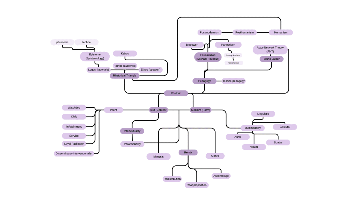
Key Terms Project
Using the course material and readings from throughout the semester, this project was intended to serve as a collection of terms that were crucial to course understanding. Using a mind map to connect concepts, the final submission included a video explaining my rationale.
Intertextual Conversation
My approach to this portfolio is, I feel, best described through the work of Kathleen Blake Yancey and Stephen J. McElroy. In their introduction to Assembling Composition, they write the following on the topic of assemblage —
This first sense of assemblage thus allows us also to see composing as proceeding from interrelated combinations of bodies, concepts, and ideas: approaching composing in this light allows us to see and trace the assembled components and to map out how they work together, how they are related, to generate a particular composition. The second sense of assemblage refers to any text resulting from such a constellation, with text being understood metaphorically
Yancey & McElroy (7)
My portfolio’s goal was to create a “constellation” of my work throughout the semester. As a student who already had a passion for both writing and editing but who was not in the English major, my intention in taking this class was to not only refine my skills but to redefine what I considered writing and editing for print and online media to be like. Readings like those of Yancey and McElroy helped me achieve this goal.
The above quote especially stood out to me. Considering the form of content to be more than just that — more so, the body of a concept or idea — was an unfamiliar but welcomed concept. I knew, then, that I wanted my ePortfolio to utilize its appearance to establish a strong impression. What kind of impression that would be, I wasn’t sure yet.
Other works like “Everything is a Remix” helped me determine that impression. While this might seem like an unconventional source of help, this YouTube video helped me frame my brainstorming in a way that aligned with my “constellation” goal. “Everything is a Remix” argues exactly what its title suggests — as we continuously create, art continues to work around, off of, and from itself, like some kind of Ship of Theseus thought experiment or piece of paper continuously folding over itself. Everything is a remix because everything is building off of something. This reminded me of a metaphor; “I am a museum of everything I have ever loved before.” In a way, we’re all remixes, ourselves, building a museum based off of every experience and memory. I realized through this that my ePortfolio needed to showcase this museum. My ePortfolio would serve as a kind of remix, crossing over writing with videos and images, all to serve my audience an impression of who I am — a young and passionate creative with countless interests.
The only remaining question was how to do that.
Dustin Edwards writes in Framing Remix Rhetorically: Toward a Typology of Transformative Work about a student who played with genre conventions. The work she created “transgressed the norms of the [genre], keeping with its typical form but radically changing its typical content” (Edwards 50). This spoke to me as something that would rhetorically suggest the impression I wanted to give to viewers of my ePortfolio. My intention was to create an ePortfolio that made sense navigationally but stood out. This passage inspired me to create an ePortfolio that followed the conventional navigation of a portfolio website, but with unique content. For example, I chose fonts that might not be chosen normally, especially on my cover page. The blackletter font is one of my favorites, but also fits stylistically with my work (i.e., the magazine spread). Yet, this is not a conventional font to use in portfolios. Using it in mine aligns with my creative style and gives a bold edge the ePortfolio. Similarly, including links to my work that isn’t necessarily academic or work-related, for example, my video essays. While some might not see the value in them, I do, and so including them in my ePortfolio continues to be a stand-out choice that creates a detailed image of a passionate creative.